Plan vs. reality
We originally founded mantra.22 to cover exclusively the clients of the HR company PERSONALITY and its sister companies. However, we came to realize quite quickly that our capabilities and ambitions far exceeded the original intention. That is why we decided to expand our portfolio and offer our services to all clients who need help building or strengthening their brand. But first we needed to perfect ours.
What Is Mantra? And Why the Number 22?
Ten out of ten creative people agree that there’s nothing harder than coming up with branding for your own agency. Let’s look at where we were coming from.
Mantra is a word that comes from Hinduism, and it can be a sentence or a syllable that we repeat to ourselves in certain situations. In fact, the Hindus believe in the identity of the name and what is denoted by it. Therefore, the repetition of a name or a word makes its signification more real. In our case, the signification is the client’s brand, and the constant repetition is the building of their name.
At the same time, the word mantra is used across the business world and represents a kind of a core of business. And that’s exactly what we want to do. In a world where companies are preoccupied with short-term goals and cheap marketing rules, we want to remind clients and companies what their foundations are.

That’s why, just as Lars Von Trier and his group of filmmakers founded “DOGMA95” years ago in 1995, where the filmmakers followed the rules that they set for themselves, so have we, almost 30 years later, come together as independent people with values and founded “mantra.22” in 2022.
Additionally, thanks to its origins, mantra is a magic word with depth and a certain air of mystery. And everyone is interested in secrets. Wink, wink.
We Have the Name, Let’s Come Up with a Logo
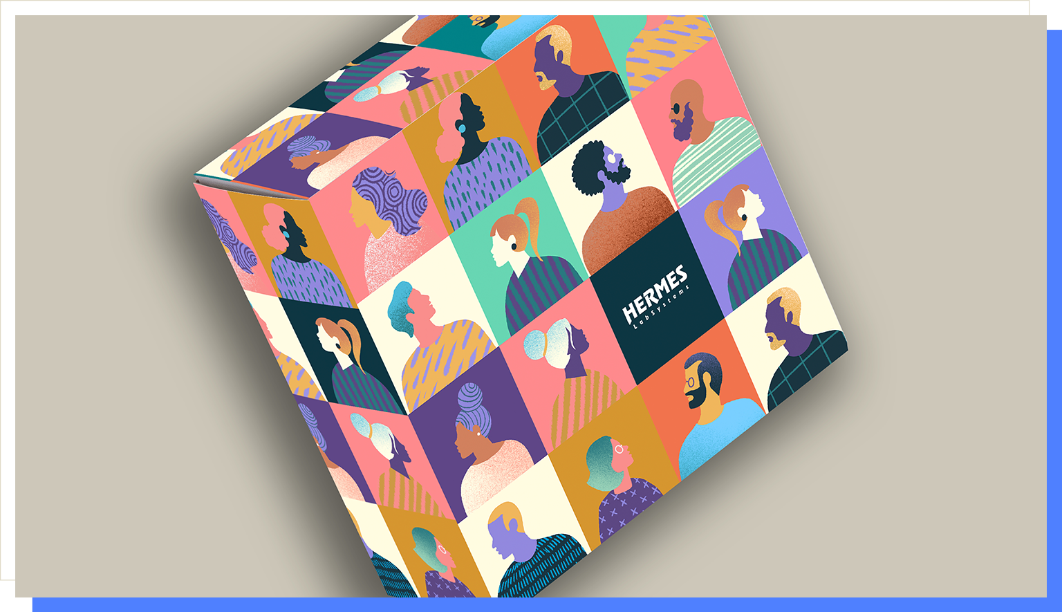
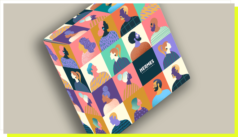
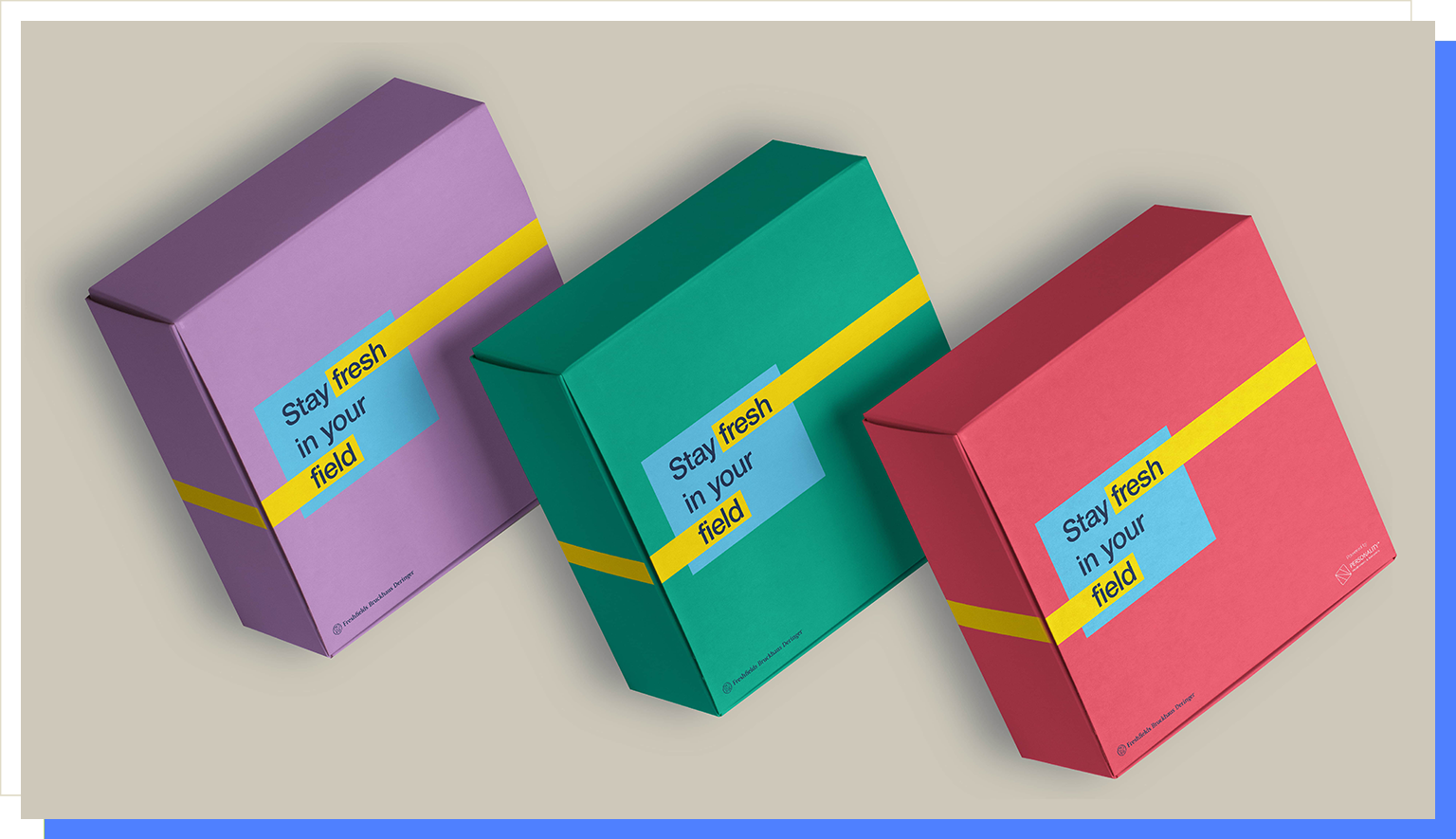
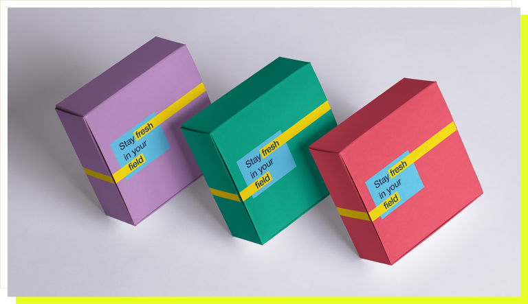
Our idea for the logo was obvious from the beginning. It was supposed to be clearly minimalistic. Since we knew it would be a part of our clients’ products (always somewhere at the bottom as a quality mark), it had to be memorable for people who would be looking at or buying their products. At the same time, we wanted unique colors, specifically mixed for us, to become the new symbol of mantra.22. And how did our ideas translate into the real form?

The specially created color palette consists of two categories of color shades – primary and secondary. The primary one consists of the neutral shades Tempting Darkness and Creamy Shimmer. The secondary palette includes the shades Ecstatic Moment and Cooling Swift and is further expanded by two complementary shades – Creamy Shimmer 50% and Morning Haze, which are primarily used to create contrast when working with shades.
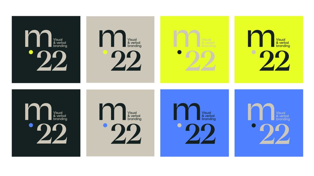
An important element of mantra.22’s identity is the combination of the Degular, Teodor and Yellix fonts, from the Czech typeface company Displaay Type. The choice of fonts was skillfully designed to represent elegance, timelessness, and style inspired by Italian design, as well as playfulness and visual impact. At the same time, the logo itself is not rigid but inviting enough to be appealing in commercial communication.

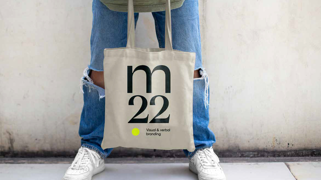
Since merchandising is a subject that we feel really at home with, it was extra important for us that the design be variable and look good on every piece. We’ve confirmed a long time ago from the feedbacks of our clients that a corporate T-shirt doesn’t have to only be used for the gym. By choosing the right materials and quality printing, it can be every colleague’s must-have favorite article of clothing. Ours looks cool too, don’t you think?
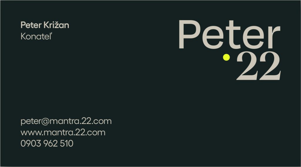
Right now, you can only see our nice business cards online, but we will be happy to exchange them with you in person. If you’re starting a business or need a refresh of your existing brand, we’re here for you. Specifically, at hello@mantra22.com.